A blog about all things interior design.

Monday, December 23, 2013

Christmas Eve


It is Christmas Eve 2013 and I am very happy to be here! It has been a fantastic year and 2014 looks like more of the same.
I would like to wish you all a peaceful and merry holiday season with your loved ones, plenty of relaxation and lots of good food.
Have a wonderful Christmas and a Happy New Year.
Photograph via Varpunen.

Read More

Sunday, December 22, 2013

Tidying up the Office


I am tidying up my office today and was wondering if I could ever get it to look as tidy as the one above? Probably not but it sure is stylish! These lovely images come from Skandiform, a Swedish furniture company who specialise in offices and public spaces. I had to add the reception area below as a reference that a pink sofa can certainly look very cool!


Photographs via Skandiform.
Read More

Tuesday, December 17, 2013

Colour Zoning


Check out the clever use of colour zoning in this French apartment and family home of designer/illustrator, Caroline Gomez. The open plan apartment has expansive areas of white, yet 'rooms' have been defined with zones of lovely colour. See the rest of the apartment here.


Photographs via yellowtrace.
Read More

Wednesday, December 11, 2013

Urban Cool at Hotel San Jose, Texas


It seems that when a holiday break beckons that hotels and holidays spots are very appealing to me as I browse through my interior design research.
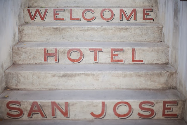
Hotel San Jose, located in the heart of Austin, Texas, was built in 1936 as a motor court - it has now been transformed into a stylish bungalow-style hotel. Look at those lush grounds and outdoor leather chairs! The hotel rooms are kept minimal and fresh with gorgeous custom sheets. Oh, dogs are welcomed as guests too. Two thumbs up.


Photographs via Hotel San Jose.
Read More

Tuesday, December 10, 2013

Kitchen Under Stairs


Here's a kitchen that I designed and had installed earlier this year.
Part of this kitchen is located under the stairs and the previous layout had the fridge and storage here - it was awkward and not well utilised. To solve this, we took the existing stair wall (around the corner) to full height and placed the fridge here, then located the cupboards above right along the back wall. This created more bench top space as well as making it feel  more spacious and streamlined.
A granite bench top was chosen (one half of the client is a geologist so very appropriate) - this one is called Kashmir White and it has dappled garnets throughout. It works beautifully with the white cabinetry.


Photographs by Charlotte Minty.
Read More

Thursday, December 5, 2013

Summer Lake House


Phew, it's seems summer has arrived. It's hot and humid - which is unusual for Wellington, and along with madly running around to wrap up the year before the Christmas break, I think people are feeling flustered. Hence the attraction to this calm and simple summer home, designed by Robert Young Architecture and Interiors, located by Montauk Lake, USA. Cedar shingled houses have always appealed to me and this sprawling family home does it so well. Some colour in the interiors wouldn't go amiss, me thinks.


Photographs via Remodelista.
Read More

Monday, December 2, 2013

Watsons Bay Boutique Hotel


Check out the cool Beach Club at Watsons Bay Boutique Hotel, Sydney. Recently refurbished, I'm loving the fresh and retro aqua colour they've used throughout as well as the overall super relaxed vibe. Getting in the mood for summer!

Top Deck Bar


The view


The new kitchen


Seafood station

Beach Club Bar


Coffee station


Photographs via Watsons Bay Boutique Hotel.
Read More

© Charlotteminty Design, AllRightsReserved.

Designed by ScreenWritersArena